

Standing at a cinema display, you can learn how to read a superhero movie poster by working outward from the biggest text to the smallest credits.
Quick answer: read the title and central image for what the film is selling, the color for mood, the placement of figures for importance, and the tagline and credits for who stands behind it. Stop when the poster’s choices make sense. Not every detail is a code.
This walkthrough is part of our pop culture commentary on comics and film. It treats a film poster as a designed object you can decode with your eyes alone, with no trailers or marketing data needed. If you want to go further into hidden references, our guide on how to spot comic book easter eggs in movies picks up where this one stops.
Start with the title and the central image
The simplest read takes seconds and needs no design vocabulary. A film poster hierarchy usually opens with the title, which one analysis of film poster codes and conventions describes as the biggest and boldest text on the poster. That size is a deliberate signal of what the viewer should register first.

- Find the largest text. This is almost always the title. Note its typeface: heavy, angular or ornate lettering tells you about tone before you read a single word.
- Find the dominant image. In the same analysis, the shark on the Jaws poster seizes a central position and is enormous within the frame. A central, oversized figure or emblem is the poster’s main promise.
- Look for genre shorthand. The same analysis reads a Batman symbol on the side of a skyscraper as a signal of violent, action-driven imagery. On a superhero poster, an emblem, a silhouette or a costume detail does the work that a single recognisable object does elsewhere.
If you stop here, you already know what the film wants to be called, what it wants to show, and roughly what genre promise it makes. That is enough for a quick glance at a display case. Go further when a poster seems to be saying more than its title and hero image.
Read the color palette and tone
Color is the next rung because it shapes mood across the whole surface. The Jaws analysis notes that the red lettering carries connotations of danger and blood, foreboding the narrative. That is a useful model: ask whether a strong color sits on the lettering, the figure or the entire background, because each placement points the eye differently.
A classroom design tutorial on building a movie poster shows how deliberate this can be. It describes laying a solid color over the artwork at lowered opacity to give the poster a warm or cool tone. That means the tint over a finished poster is often a choice, not an accident of the photography or illustration.
Use this as a method rather than a dictionary:
- Judge temperature first. Decide whether the overall image feels warm or cool, then ask what mood that pushes toward.
- Look for the accent. Find the one color that stands out against the rest, often on the title or an emblem, and connect it to the film’s promise.
- Avoid fixed meanings. Red pointing to danger in one analysed poster does not make red a universal code. Treat any color reading as a hypothesis that the rest of the poster should support.
When color and typography agree, such as a threatening hue on heavy lettering, the reading is strong. When they pull apart, the poster may be hiding a twist in tone, or the design may simply be crowded.
Check how characters are arranged
Arrangement tells you which character the poster wants you to remember. Centrality and scale are the clearest evidence: the Jaws analysis highlights how a figure in the middle, drawn very large, commands the layout. On an ensemble superhero poster, the figure nearest the centre and largest in the frame is the one the design elevates.
Treat that as what the poster promotes, not as a statement about screen time. Ask these questions in order:
- Which figure is largest?
- Which sits closest to the middle line?
- Which faces the viewer, and which looks away or recedes?
Balance matters too. The poster-making tutorial asks students to use an odd number of photos, at least seven, because the imbalance causes movement in the finished poster. That is an instruction for a student exercise, not a rule studios follow, but it explains why a lopsided crowd of heroes can feel energetic while a perfectly symmetrical layout feels formal or static.
Layout can also be shared across a set. The same tutorial points to multiple posters with the same artistic style and only a couple of differences. When you see character posters that repeat one composition and swap the featured hero, the shared template is the campaign’s identity and the swapped figure is the message of each version.
Read the tagline and billing block
The lower and upper edges of a poster carry the most literal information. In the analysed Jaws poster, the gag line is centred at the very top on purpose, to draw viewers in. On any superhero poster, check where the tagline sits, how large it is, and whether it speaks about the hero, the threat or the stakes.
The bottom is where the credit block lives. The same analysis points out that three main actors’ names appear in bold white font that stands out against the black background. Prominence in the block is therefore a visible design decision, and the contrast is as telling as the order.
| Poster element | What to look for | Planning use |
|---|---|---|
| Title | The biggest and boldest text on the poster | Confirm the film’s name and read the typeface for tone. |
| Tagline | In the analysed example, centred at the top of the poster | Treat it as the hook; note whether it addresses hero, threat or stakes. |
| Actor names | Three lead names in bold white against a black background in the analysed example | Check how much contrast and space the names get, not just their order. |
| Producer, studio logo and studio name | Listed among the standard items on a poster | Identify the companies behind the film. |
| Web address and rating | Also listed among standard items | Use them to find official material and check the audience classification. |
The elements above come from the poster-design assignment instructions, which list title, actor names, producer, studio logo, studio name, web address and rating, and from the film poster conventions analysis.
Use the table as a checklist. A poster that includes most of these items is a fuller, more official-looking piece of print. A poster that strips them back leans on image and mood instead, which leads to the next question.
Spot references to comic cover art
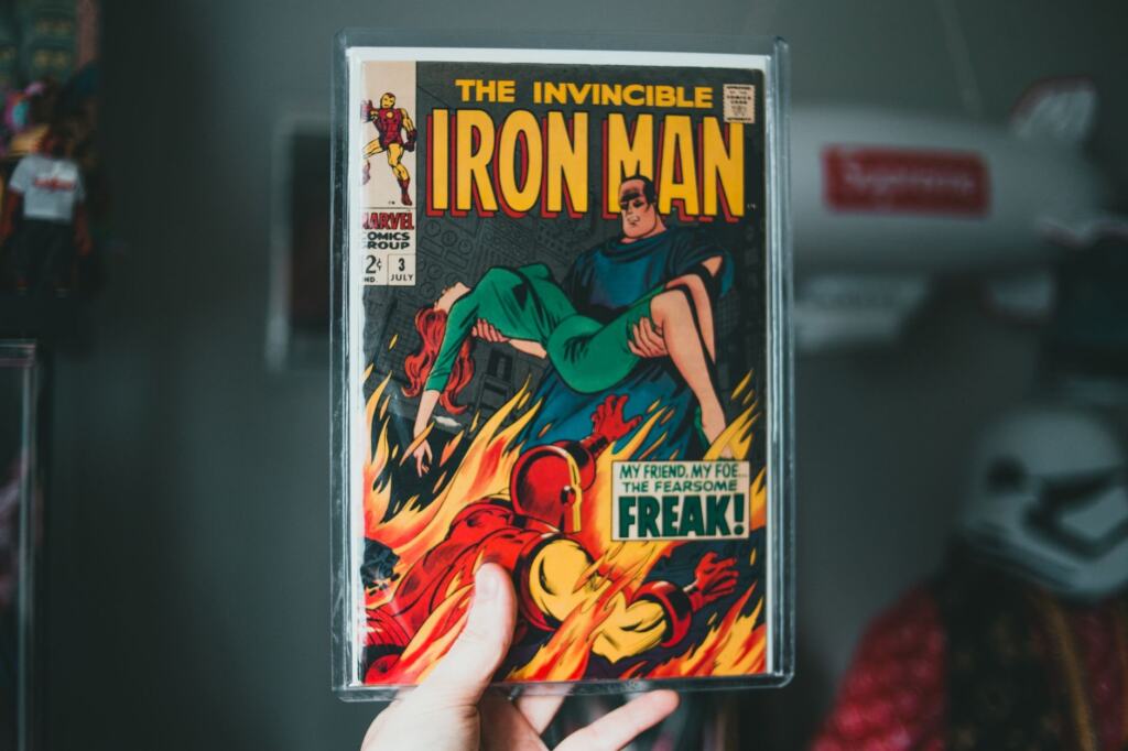
Superhero posters often borrow from the comics they adapt, and the borrowing is a message to a specific audience. The conventions analysis notes that referencing a No.1 trade book emphasises the fan base from the initial book. In other words, a nod to the source publication is aimed at readers who already know it.
To read those nods, compare the poster against the character’s cover art, if you can find it:
- Pose and framing. Does the hero stand, leap or loom the way the cover figure does?
- Emblem treatment. Is the symbol drawn large and flat like a cover logo, or integrated into the scene as in the Batman skyscraper example?
- Wording that points at the books. Any line referring to the original publication is a direct appeal to existing fans.
Keep the claim modest. A similar pose can be coincidence, so a reference is only worth reporting when two or three of these cues line up with a specific cover. Hunting for deeper hidden details is a separate skill, covered in our easter egg guide linked earlier.
Tell a teaser poster from a final poster
No single mark separates a teaser poster from a final one, so compare several signals instead of trusting one. Start with how much of the credit information appears. Measure the poster against the standard list of items above: title, actor names, producer, studio logo, studio name, web address and rating. A teaser tends to rely on image and tagline, so if you see an image and a hook with little else, treat it as a possible early piece and look for a fuller version.
Next, look at the tagline. The poster analysis shows a hook placed at the top to pull viewers in, which is the kind of job an early poster does when there is little else to show. Finally, look for a family resemblance. When several posters share one artistic style and differ only in the featured character, as the poster tutorial describes, you are probably looking at a set. Compare each version to see which carries the fullest credit block.
A side-by-side gallery makes this much easier. A collection of superhero movie posters presented as a gallery lets you compare title size, central figures and color across many films in one sitting.
Checkpoints and when to stop
Work down the ladder only as far as your purpose requires, and stop when two or more cues give the same answer.
- Glance reading. Title and central image agree on genre. Stop here for casual viewing.
- Mood reading. Color and lettering point the same way. Stop here if you only need the tone.
- Hierarchy reading. Size and position of the figures show who the poster promotes. Stop here for comparing ensemble casts.
- Credit reading. Tagline and billing block identify the people and companies. Continue only if you need to cite them.
- Source reading. Compare against comic covers. Stop if fewer than two cues match.
One caution applies at the top of the ladder. An image with no clear origin, such as a cropped screenshot of a supposed poster, is not a reliable basis for conclusions. Before repeating claims drawn from it, read our advice on how to write about movie rumors responsibly.
Frequently asked questions
What is the quickest check when I have only a few seconds?
Find the largest text and the largest figure. Together they give you the film’s name and the poster’s main promise.
Do poster colors mean the same thing every time?
No. Red lettering reads as danger and blood in the Jaws analysis, but that is one poster’s reading. Test any color against the typography and imagery around it.
Is the tagline always at the top?
Not necessarily. The analysed poster centres its gag line at the highest point, but placement varies, so check where each poster puts its hook.
Do design assignments describe how studios really build posters?
They describe common parts and techniques, such as the standard list of credit items and warm or cool tinting. Use them as a vocabulary for reading, not as a studio rulebook.